Happy University Press Week to everyone who is celebrating alongside the members of Association of American University Presses (AAUP). Today, members of the university press community are sharing information, stories, and tips about book design.
Athabasca University Press books have been recognized on many occasions by both regional and national associations for their high production values and beautiful design. Yes, we’re open access and yes, we love the printed book. Whether it be a beautifully balanced page, a clever cover design, or a stirring image we, like so many of you, dote over our books, agonize over the smallest detail, all in the hopes of finding the right package for the words and for the reader. Writing about using open source typefaces on behalf of Athabasca University Press is our in-house designer and web technician, Sergiy Kozakov.
A Book Designer’s Toolbox: Free Fonts
A text typeface, or type used for the body of a book, is the backbone of book design. Most professional book designers find themselves returning to a favourite set of reliable typefaces over and over again. For scholarly books, this list is often comprised of a few traditional humanist and modern typefaces that have been tested by time. Classics like Sabon, Caslon, Baskerville, Garamond, Jenson, Bembo, Minion, and a few more are in every book designer’s toolbox. But sometimes a manuscript will require something new, something fresh and so you begin the search for the perfect typeface. More often than not your search will end when you find the perfect commercial font that neither you nor your client can afford.
Open-source fonts: Time to take another look
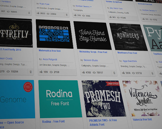
Traditionally regarded by most professional designers as junk, free and open-source fonts have recently gained more acceptance on the design scene. Open-source initiatives by companies like Google (e.g., Google Fonts), the emergence of open-source type foundries like The League of Moveable Type, and an abundance of online platforms for creative people to share and evaluate their work publicly (e.g., Behance), has spurred a new creative wave of free and open-source font designs. As a result, the number of professional-quality fonts that have been vetted by designers has grown exponentially.
Before you get too excited . . .
Is it time to take a second look at free text typefaces for your next book design project? My first answer is “yes,” but let me qualify that answer with a cautious, “It depends.”
Unlike popular literature, scholarly texts have very specific text requirements. Most scholarly manuscripts will need OpenType font features such as small capitals, oldstyle figures, ligatures, fractions and support for foreign characters. The completeness of this list of additional features is what makes or breaks a good text typeface and not all free fonts come with these features. I’ve been following the rise of popular free and open-source typefaces for the last two years and I have found that very few of the free text typefaces that are suitable for scholarly books support a full range of typographic features. Moreover, these free typefaces rarely come with more than three variants—regular, italic, and bold: a number sufficient for a meat-and-potatoes project but too restrictive for a more complex project.
At the moment, free text typefaces are hardly any match for commercially available fonts but the continued improvement seen in both the quality and availability of free typefaces makes them an ever more attractive option for smaller publishing houses with smaller budgets.
A few good fonts
Below is a list of a few of my favourite open source fonts. I think you might be surprised by the distinct character and polish of each typeface and maybe you’ll find the perfect match for your next typesetting project. Enjoy!
Alegreya (The Alegreya font family also includes free Alegreya Sans and Alegreya SC)
Designed by Juan Pablo del Peral.
“Alegreya successfully balances some risky stylistic choices with solid technique, resulting in a delightful mixture of the classic and the playful.” (Typographica)

Calendas Plus
Designed by Atipo Fonts.
“Calendas Plus is a typeface with a classical air, great legibility and elegance, designed for work in small sizes. Its special characteristics derive from its calligraphic finishing. Calendas Plus offers a number of ligatures & alternate forms, including R and K swashes, a Q alternative and titling ligatures.” (Calendasplus.com)
Feature set: ligatures & stylistic alternates, case-sensitive forms, small capitals, fractions, superiors and inferiors, wide language support.
Note: regular (free), italic, bold [full typeface can be bought for as little as £3]

Source Serif Pro
Designed by Adobe.
“Source Serif was designed by Frank Grießhammer as the serif counterpart to our popular open-source Source Sans family. With its simplified, eminently readable letter shapes, Source Serif is well-suited for digital environments, and shines when used for extended text setting on paper or on screen.” (Adobe Typekit Blog)

Fontin (also available free Fontin Sans)
Designed by Jos Buivenga (exlibris Font Foundry).
The Fontin is designed to be used at small sizes. Available in roman, italic, bold & small caps. The color is darkish, the spacing loose and the x-height tall.

Cardo
Designed by David Perry.
Cardo is a large Unicode font specifically designed for the needs of classicists, Biblical scholars, medievalists, and linguists. Since it may be used to prepare materials for publication, it also contains features that are required for high-quality typography, such as ligatures, text figures (also known as old style numerals), true small capitals and a variety of punctuation and space characters.